Increasing user engagement through a personalised homepage

Project overview
Ignite is an app used by real estate agents to tap into the largest, most engaged property audience in Australia. The goal was to increase Ignite's user engagement score from 10 to 25 out of 35, by creating a personalised feed with live competitive data that would become essential to agents' daily workflows.
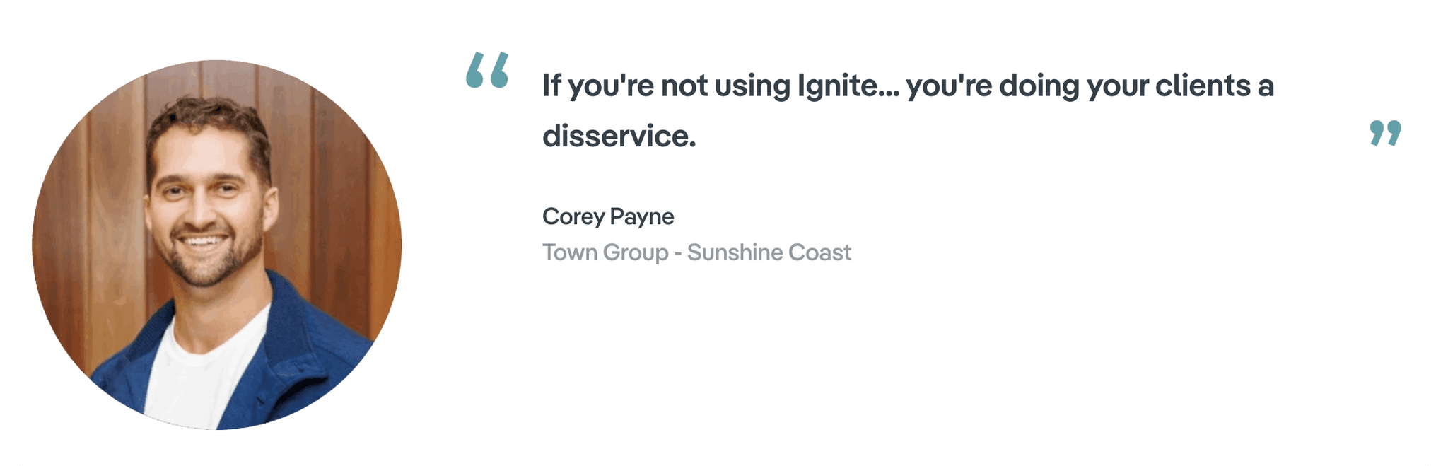
I spotted gaps in the research that needed filling. The findings changed everything, saving development rework and delivering a homepage that 1000 beta users found genuinely valuable.
Role
Product designer owning the Ignite homepage and design system, plus helping other teams build consistently across the platform. I ran the user research that revealed some major gaps and led to the redesign that followed.
Brief
Complete the Ignite homepage redesign while ensuring the components could be reused by different teams across REA. The challenge: design for server-driven UI to cater for unknown content types - the system had to adapt to whatever teams wanted to display.
The old design
Ignite had so much potential but the current information architecture made it really difficult for real estate agents to easily use it.
With a user engagement score of 10 we knew that real estate agents were dissatisfied and wanted a lot more from the tool than it was currently offering.


Designing an intuitive navigation structure
The aim was to move away from the 'Properties' tab being the default landing and to introduce 'Home' to the nav.
Why? Because we understood from users that they wanted a place to see more information and in depth data related to their properties. The current version just displayed the bare minimum information.

Creating a personalised home screen
We had solid existing research indicating the requirement for a designated, personalised home screen, showcasing details such as buyer/seller enquiries, expiring or rotating properties, reviews etc.
Before I joined, the team ran a card sorting exercise that indicated the relative importance of the home screen content and from this designed the home screen.
Upon joining the team I quickly realised the need to dig deeper into the context behind the ranking. Card sorting told us what agents prioritised, but not why, or what they actually wanted to see.
We needed some qualitative research to complement the quantitative data.
Deciding to pivot
To make sure we hit out goal of increasing the engagement score from 10 to 25 we needed user feedback on the approach to check we were tracking in the right direction.
I saw an opportunity within the development roadmap to do some testing - there was a heavy engineering backlog which gave design some breathing space.
I got buy in from the Product Manager and ran user testing to fill the qualitative gaps. We tested with 8 real estate agents.
Research goals:
1 - Understand if the content and component hierarchy matched what agents actually prioritised
2 - Understand if we were showing the information in the expected way
3 – Understand if there was anything that agents might want to see that is currently missing
Testing highlighted 3 key issues
1 - Confusion around what sections were communicating - especially 'Recently viewed'.

2 - Unclear UI elements like badges and coloured tags; agents found them confusing which hindered the meaning of entire sections.

3 - Agents wanted information grouped by tasks they needed to complete and wanted to be reminded of high-priority tasks
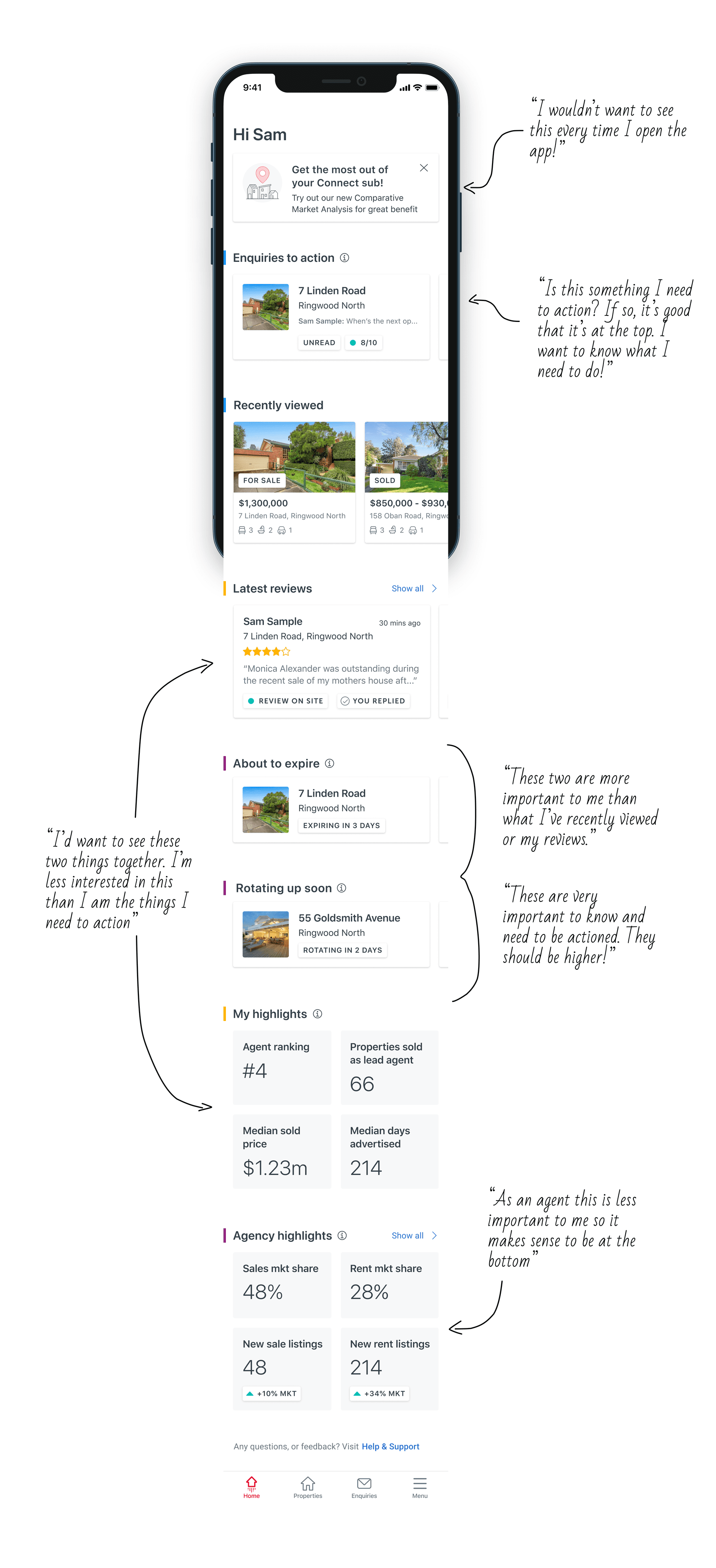
These findings were clear proof that understanding why users ranked sections during card sorting was vital context; they actually wanted to see the screen organised differently to what was interpreted.
'Why are we changing the design this much?'
The research pointed to some significant page and component hierarchy changes, but the team had already started building based on the existing designs. Understandably, this created some tension around potential rework.
I ran workshops to share the research findings and collaborated on solutions that would address user needs while minimising disruption to the timeline. We found a path forward that improved the designs without derailing delivery.
The iterations
Restructured the hierarchy of the page - ensuring actionable tasks are prioritised
Completely restructured 'Enquiries to Action' into 'Latest hot leads'

Reduced the amount of sections on the homepage so all are necessary and useful

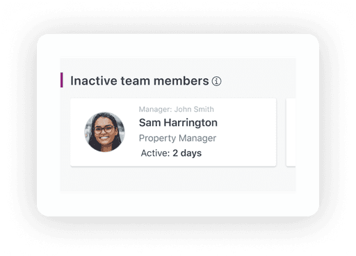
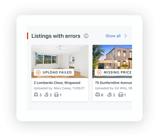
Designing for flexible content
These components needed to scale for other teams across REA. Below are some examples of how each component could be reused in different contexts while maintaining consistency.
Horizontal image card
Horizontally aligned card featuring a small image, a brief copy block with optional CTA.


Text card
For information that didn't need visuals and prioritised copy.


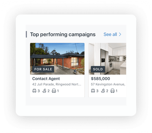
Vertical image card
Hero image with supporting copy and iconography with optional badge over image.

Outcome
🚀 Successfully launched Ignite's first homepage to 1000 beta users
We prioritised the initial sections launched by balancing user needs and development timeframes.
📈 Successfully increased Ignite's user engagement score from 10 to 23
Although we were aiming for 25 this was proof we were heading in the right direction.
Next steps: do more testing with users of the beta app and iterate based on feedback.
⚙️ Established new collaborative processes
Beyond the homepage, I helped establish design QA, ticket kickoffs, and ideation workshops that improved how design and development worked together.